Sunday, October 14, 2012

The Power of Pink


In keeping with the groundbreaking feminist education program at the Woman’s Building in Los Angeles, in 1974 Sheila de Bretteville designed Pink, a meditation on color and feminine identity.  The poster responded to a call for submissions issued by the American Institute of Graphic Arts (AIGA), which was looking to grow a scholarship fund by asking one hundred of its members, an impressive array of artists, designers, and photographers, to interpret the word “color.” While many chose to exploit the prismatic variety of hue, saturation, and value, de Bretteville chose a single color.  Using thirty-six squares of pink paper, she solicited various women to shape, model and, to some minds, distort their reactions to this furtively fussy and feminine color. 


Times have changed, and pink’s new engagement with major league football is fascinating (if utterly different from the way the color was envisaged in de Bretteville’s poster or even James Jaxxa's 2004 Pink Football).  


The patches of color on cleats, jerseys, wristbands and fields are striking. So much for the color being feminine. Or is it? Pink has a history that transcends as a fighting color (as a variant of red).  But others say it’s about NFL promotion, and the creation of new, consciously feminized clothing that can now be sold with professional teams’ other paraphernalia profits the owners and not cancer research. 

It's hard not to see the spectacle today and not think back to Judy Chicago's Fresno Art Program's Cunt Cheerleaders c. 1971.

Tuesday, October 2, 2012

Eastern European posters


In my research, I've been struck by the aspirational quality of Eastern European posters.  For instance, the Czech New Wave film director Jiri Menzel  used Larks on a String (krivánci na niti) (1969) a movie set in grim postwar Czechoslavakia,  to critique Pollyannaish posters.  A political satire made during the Prague Spring, the film tells the story of  a labor camp  situated in a vast industrial dump.   Never is the gap between Marxist theory and practical reality  more clear than when a shy couple pose for a state-sponsored newsreel; party functionaries insist that they sit before a brightly colored poster depicting an idealized man and a woman . 

In Poland, Andrzej Wajda’s 1977 film Man of Marble  (Czlowiek z marmuru), explored the underside of socialist propaganda as well. In this case, the film-maker follows the rise and fall of Mateusz Birkut, a humble bricklayer who, in the late 1940s, is mythologized as a model worker. Using newsreel footage of crowded parades, cheerful martial songs, idealized statues (including a marble one mentioned in the film’s title) as well as over life size posters, director Wajda also critiques the official Soviet-style art and the scaffolding that propped it up.  Individuals are submerged behind idealized, constructed images.  The rickety structure girding this system is nowhere more clear than Birkut’s fall from favor, when he loses his state-sponsored apartment and witnesses the massive posters of himself pulled down.  

Tuesday, September 11, 2012

Here Come The Bronies: No Pony Pushover

While in Seattle last month I stayed at the Marriott and stumbled on one of the most interesting conventions I've seen for a long time.  We knew something was up when we entered an elevator with a twenty-something man with a "My Little Pony" shopping bag.  But, as he and my ten-year-old compared notes, it became clear that this isn't the same little pony at all.  That is, Pinkie Pie, hasn't been killed, off, and Rarity is still the jazziest pony this side of Unicornia.  But the new ponies no longer spend their days planning picnics and finding the perfect gift for each  birthday party. This is my daughter's favorite, Pinkie Pie  (c. 2006) and a My Little Pony storybook featuring her:


Suddenly, however, Rarity has been channeling her inner Bruce Lee and Pinky Pie seems to have revealed a diabolical side to her personality.  Indeed, a quick web search revealed that this is a recent transformation. Hasbro's My Little Pony franchise was changed from bottom up by Lauren Faust.  She helped change and develop the Powerpuff Girls, another gender-crossing TV show. Now she's helped "reboot" the equestrian series as "My Little Pony: Friendship is Magic."  Little wonder that it is now attracting an adult male, and occasionally female audience (which calls itself "bronies," as in "bro" + "pony").  The change is intriguing in design terms. This is the new Pinkie Pie:


Big eyes, big teeth, and fluffy sculpted hair. . . And a major course in assertiveness training ("we little ponies. . . are noooo pony pushovers").  . .

Wednesday, August 29, 2012

The Universal No in Arizona

Just back from our grand tour of Arizona, California, Washington, British Columbia and Alaska. While in Arizona, I began to notice all the "no gun signs." Most show a handgun crossed out.  Nice example of the "universal no" in action.


I began photographing them, but quickly learned that this was a sure fire way to strike up conversations with anyone nearby. I got tired of it and finally stopped after someone at a swimming pool pulled me aside.  Alas, the photo above isn't mine, but looks pretty typical.

Wednesday, May 9, 2012

Making Things by Hand

I've just been having some edifying discussions on "making" by hand and its role in design and craft. And now I see that the National Association of Swedish Handicraft Societies (SHR) is branding itself to include DIY, Guerilla actions, Craftivism, Recycling and other strands.  Their new poster is meant to sum this up in a wordless fashion:

Monday, April 23, 2012

Knowing Their Space: Signs of Jim Crow in the Segregated South


“They had black, well it was “colored” back then, on one side and “white” on the other, and we had our place on the bus, we had our water fountains for coloreds and our bathrooms for coloreds . . . we figured that’s just the way it’s supposed to be.” -- Sheila Florence

My article on segregation signage in the American South has just appeared in Design Issues. Although "Jim Crow" signs have a complex history and are examined as a social and semiotic form, I interpret  them differently.  These signs are an early, if incomplete, example of wayfinding signage. Design historians have paid scant attention to Jim Crow signs as artifacts, or as parts of processes or systems, but doing so illuminates important aspects of the signs’ function and appearance, examining how their style made them meaningful and authoritative. Even more important, when recognized as a feature of communication design history, they remind us how often design is used to enforce social regulation.


Nigerian posters


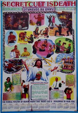
As I finish my book Poster: Paper as Fetish, Enchantment, and Trash in the Twenty-First Century, I've become hooked on the status of West African  posters today.  While I love popular posters that describe current events as well as urban legends, like this description of a secret cult.
 
But I've become especially interested in the heavy posting of election posters. To this end, I was amazed to see a 31 second, this television spot, issued by the Federal Road Safety Corps of Nigeria and posted on You Tube earlier this month, highlighting a safety hazard  has posted a short promo warning of election posters.  For years, pundits decried the ensuing visual mayhem as posters were plastered "indiscriminately on bridges, road medians, major roads and expressways across the state.” But a poster covering a highway safety sign? Note the car crash in the background.