
Wednesday, December 21, 2011
Electric Dreams
I'm currently writing on retro-futurism and am startled to find a series of chromolithograph postcards published by the printer Villemard. Their visions for the future in the year 2000 include flying firemen and teachers who feed books to machines hooked up to students' brains. Books go into the meat grinder and behold, ideas come out like electricity.
Sunday, November 27, 2011
The Woman Behind Mac's Icons
As I get deeper and deeper into my current research project (California's Matriarchy of Design) the more I admire the early designers and adopters of the Macintosh. So I was especially pleased to see that Susan Kare has come out with Susan Kare Icons, a self published book on her innovative work for Apple in the 1980s and numerous other clients ever since. Especially interesting are the sketches that she made (on a $2.50 graph paper sketch pad purchased at University Art Supplies in Palo Alto no less!) that introduce the now familiar interactive icons for the Mac. Steve Silberman has published parts of the new book's introductory essay on NeuroTribes.

Thursday, November 10, 2011
A Map of a Holiday in Hell
Since I was a little kid, I've been interested in maps and ideas of wayfindings. But I've never seen anything like these maps, courtesy of the blog Strange Maps.
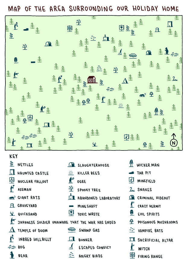
Just in time for the holiday season (I no longer have to explain to my family why I don't want to go camping--I can just show them this):
A Map of a Holiday in Hell
Tuesday, October 4, 2011
Kinetic Typography
What really makes kinetic typography work? In 50 Amazing Examples of Kinetic Typography, Neeru Banghu lists prime examples that combine text and animation. A personal favorite is Stephen Fry's Language.
Thursday, July 28, 2011
An Academic Author’s Unintentional Masterpiece: Ouch
As an academic journal editor, I've seen all kinds of writing. But rarely is the academic article so cleanly castigated as Geoff Dyer's "An Academic Author's Unintentional Masterpiece." It makes an promising start for his new regular column, “Reading Life,” for the New York Times' Book Review.
Sunday, July 17, 2011
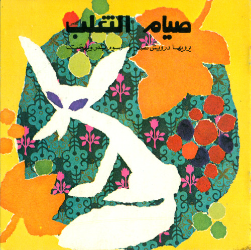
Arabic Children's Books
While researching Arabic type and printing, I ran across these wonderful children's books from the collection of Maya M., on view her tumblr Soorah:
Thursday, May 26, 2011
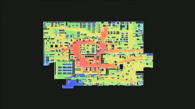
Dark Patterns

Heat map of IKEA Floorplan, showing shoppers' paths
It all began when I wanted to go back to the lighting section and take a second look at a desk lamp. But how do you do this quickly, if you've already entered the outdoor furnishing section at IKEA? For years I've noticed that I always leave IKEA in a bad mood, tired and frusterated. But now I wonder if it just isn't fatigue. . .
What Ikea have done is taken away something which is very fundamental, evolved into us, and they’ve designed an environment that operates quite differently, given that we are forward facing people, embodied [...] from the way it would happen if you just looked down from outer space. Its effect is highly disorienting.
Ikea is highly disorienting and yet there is only one route to follow. [...] Before long, you’ve got a trolley full of stuff that is not the things that you came there for. Something in the order of 60% of purchases at Ikea are not the things that people had on their shopping list when they came in the first place. That’s phenomenal. There is a complete disjunction between those two.
Monday, March 21, 2011
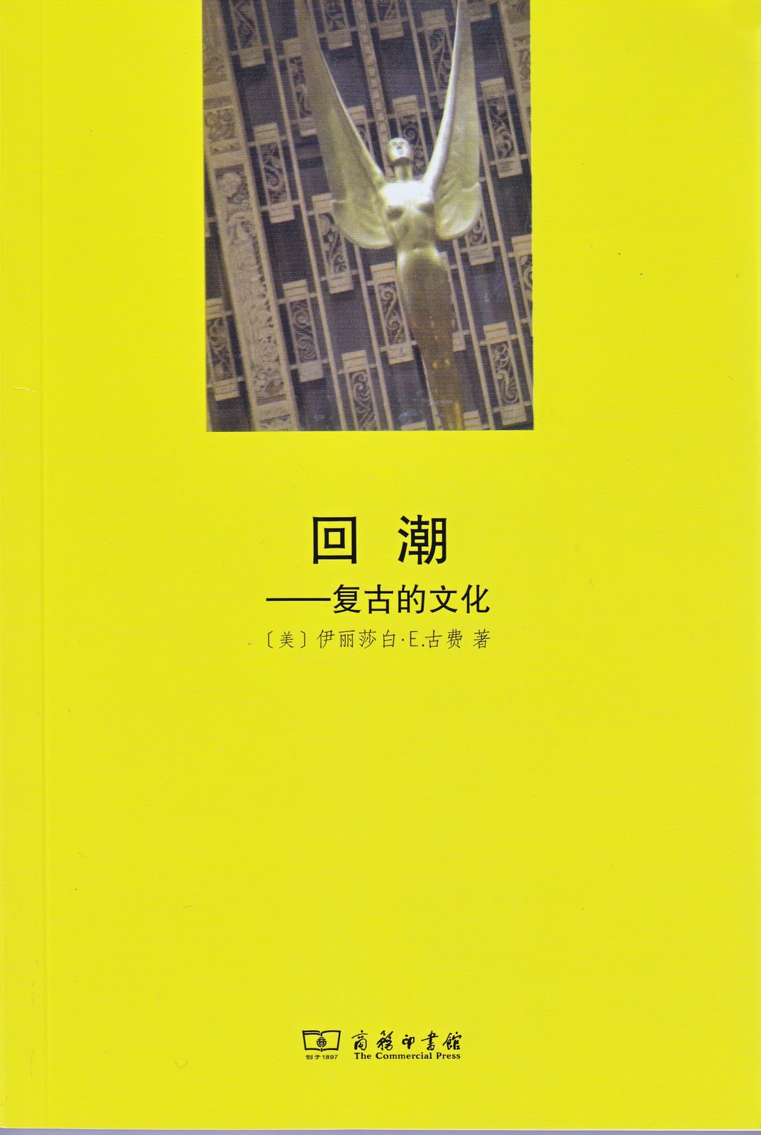
Retro in Chinese
My book Retro: The Culture of Revival (Reaktion: 2006) has just been released by Beijing's The Commerical Press, in Chinese translation:

Sunday, March 13, 2011
"What's Art Got To Do With It?"
"What's Art Got To Do With It: Design Writing in the 21st Century," the panel I co-chaired at last month's College Art Association, is mentioned in the blog of the Dutch magazine Metropolis M. They note that "the kind of discussion that occurred in “What’s Art Got to Do with It?” demonstrates a fruitful approach that must be pursued" as the field develops in the US.
Wednesday, March 9, 2011
Characters of Fire
I've always been drawn to the bombastic fat faces that acquired a size and ornateness never seen before the nineteenth century. These fonts carved a new terrain of public readership with the strategic use of short declarations, exhortations, and aggressive questions, intended to catch the eyes of viewers who were on the move. Indeed, commentators in the nineteenth century often note that these large, ornate, and mechanically-crafted scripts were tersely vivid. Throughout the century, the term “poster letters” suggested textual messages that were emotionally charged, their design conveying urgency. Moreover, such letters were frequently described as “glaring” “flaming” or “flaring” their words. As Dickens put it, there was a proliferation of “characters of fire.”
This type was intended for public readership, so I'm amazed to come upon a little-known typographic experiment from 1837. A series of sermons and spiritual guide, Heavenly Incense, A Christian’s Companion is published entirely in fat faces. Moreover, they are printed in bold. As one nineteenth century print expert noted, “the forbidding solemnity of every page is indescribable.” To my amazement, though, the book made it into a second edition. Endorsements in the second version, published in 1847, specifically note the type; Baltimore’s Lutheran Observer, for instance, claiming that “The print is very large and distinct, so that the aged and others, whose sight is very weak, may read it with ease.”

This type was intended for public readership, so I'm amazed to come upon a little-known typographic experiment from 1837. A series of sermons and spiritual guide, Heavenly Incense, A Christian’s Companion is published entirely in fat faces. Moreover, they are printed in bold. As one nineteenth century print expert noted, “the forbidding solemnity of every page is indescribable.” To my amazement, though, the book made it into a second edition. Endorsements in the second version, published in 1847, specifically note the type; Baltimore’s Lutheran Observer, for instance, claiming that “The print is very large and distinct, so that the aged and others, whose sight is very weak, may read it with ease.”

Wednesday, February 16, 2011
A series of unfortunate events
I've been tracking Michael Wolf's Google street view project A Series of Unfortunate Events for the last couple of months--mainly out of my own fascination with Google's ambitious mapping project. 
In a similar vein, back in 2009, Jon Rafman posted and discussed a series of enigmatic pictures captured from Google street views. Is it art? Is it reportage? Is this some new take on appropriation?
While Rafman's images were often quite lyrical, Wolf's project is much more disturbing. Wolf leaves us with a collection of haunting images of car accidents, school yard bullying, drive-by shootings and heavily armed men who wonder through crowded streets, all seemingly captured by Google's car-mounted robot cameras. We see the world through the lens of a casually callous nine-eyed camera. Now I see that he's just received honorable mention from the World Press Association's annual awards.
Wolf sees his project as a portend of things to come. He was recently interviewd in the British Journal of Photography. There he suggests that "a large part of our future will be the curating of all these images. Can you imagine the number of images stored in our world today? It's unlimited. In 100 years, there will be professions such as 'hard-drive miners', whose mission will be finding hard-drives in electronic junkyards and developing software to sort these images. And then there will be art projects and sociological projects created using images mined from electronic storages."
Tuesday, February 15, 2011
College Art Association panel
Having chaired a panel on Design Writing at the annual CAA conference, I've grown more and more interested in design curricula and how writing, communications, and design studies actually relate to one another. Above all, the conference highlighted some serious gaps in design studies education in the United States. This needs to be more carefully scrutinized; if design studies continues to grow as an academic discipline, it's essential that the strengths of a liberal education be brought to the table.
Subscribe to:
Posts (Atom)